Observations
 The Observations page is accessed from the left hand navigation bar:
Overview
The Observations page allows you to view Earth Observation data on the map and overlay your own asset data on top. Observations, such as Land Surface Temperature provide historic insights that are at a finer "spatial resolution" (i.e. more granular) than climate projection data. Observation data may comprise of both daily observations or monthly averages, helping us understand how assets might be exposed during particular scenarios - such as during a heatwave - or explore trends in changes of monthly averages.
Visualising Land Surface Temperature (LST) data
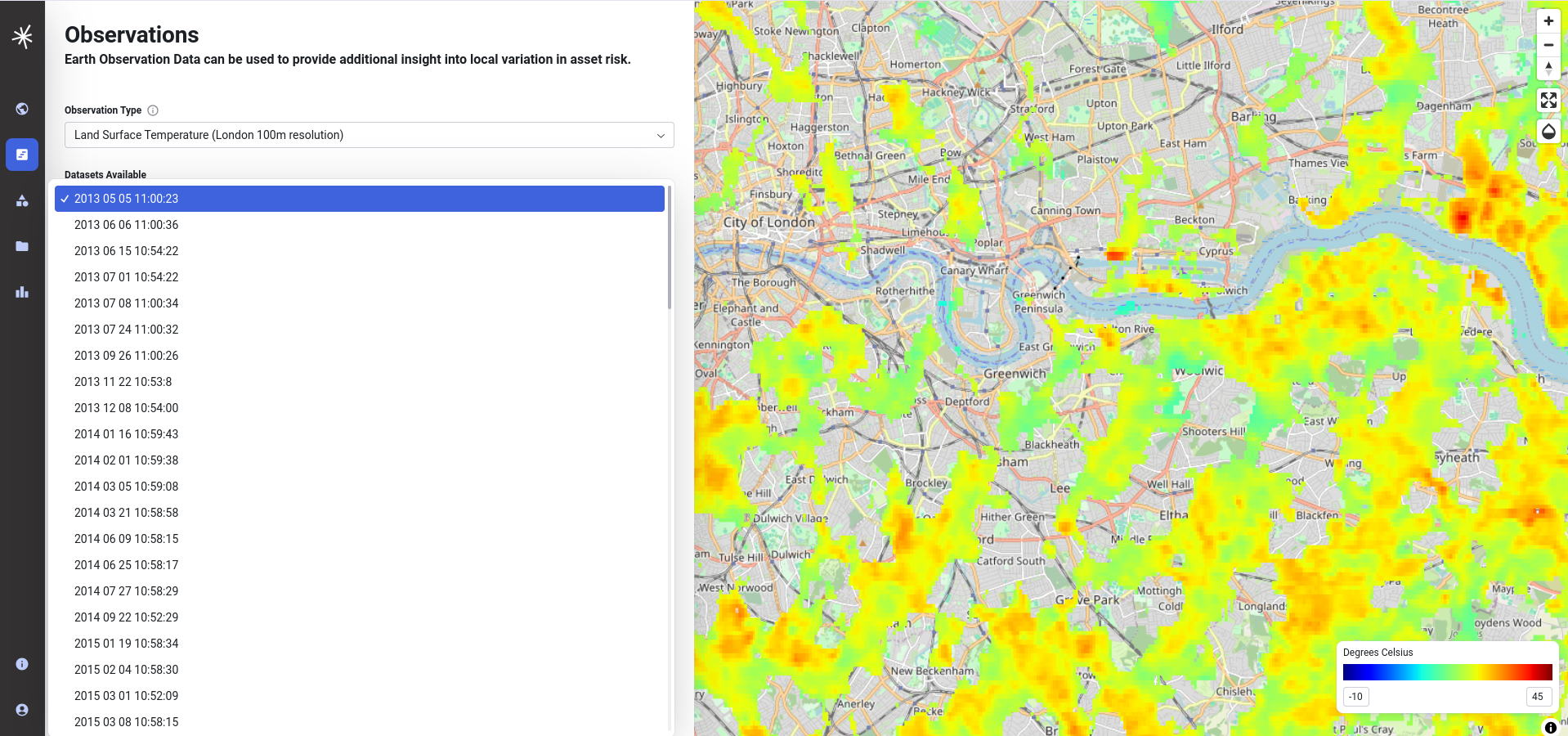
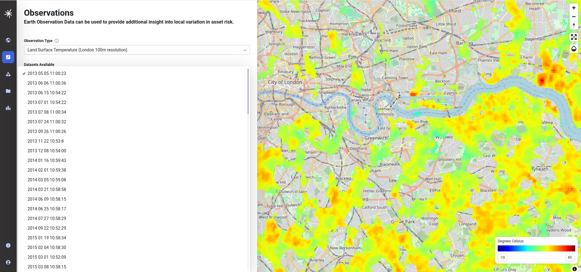
The left hand side of the Observations page allows you to select the observation data that you can view on the map. The current release includes 1km resolution data for the UK for with day and night observations between January and September 2024 from Sentinel SLSTR and 100 metre resolution data for London between May 2013 and October 2020 supplied by the University of Leicester. On selecting the appropriate category from the dropdown, the available datasets will be updated accordingly.

Note
LST datasets will be on-boarded to the hub as core datasets December 2024 and March 2025 and the application will be updated accordingly. An improved user interface for filtering datasets by criteria such as recurring date periods will be introduced to make it easier to explore trends and patterns. Data for monhtly averages will also be available for exploring general trends.
LST methodology
A citation for how the data has been derived is included in the methodology tab.

Inspecting LST values
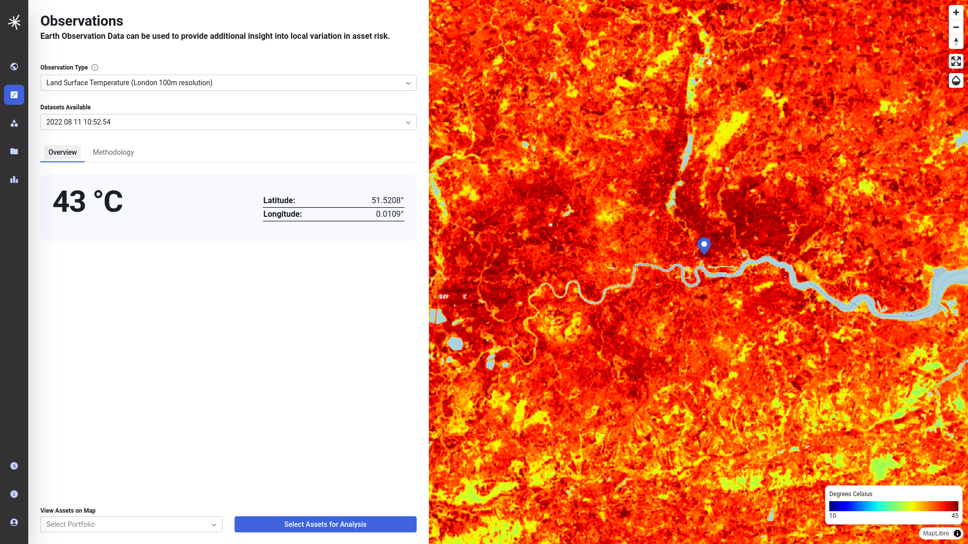
If you are interested in the LST at a specific location, simply click on the map.
Adjusting the opacity of the map
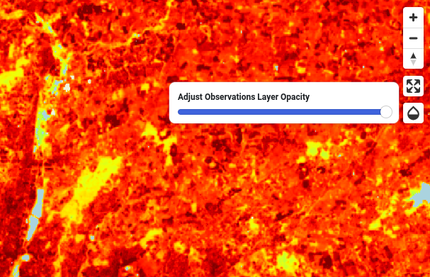
On occasions it may be useful for you to visualise data 'beneath' the indicator - such as the background maps. This can be done using the opacity control that you will find on the top right hand corner of the map window near the navigation controls.

Full screen view
The map can be displayed in full screen view by selecting the expand icon in the top right corner by the zoom controls.

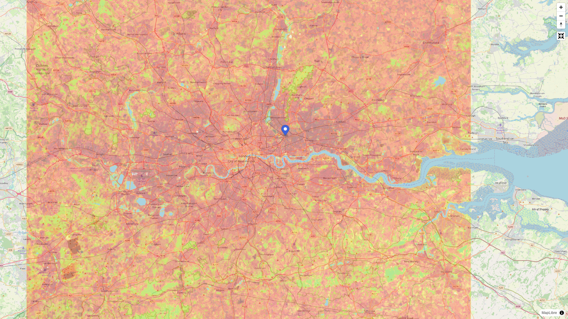
Return to the normal view by pressing the Esc key.
Changing the range of values for the colour ramp
The default colour ramp that is used for display on the map covers a broad range of temperatures that reflect potential variation throughout the year in the UK and is scaled between low (-10 degrees) and high (45 degrees) values. On occasions it might be preferable to change this display range to expose more variation within a given scene.
In this example from the 2022 July heatwave in London the data falls at the very top end of this scale.
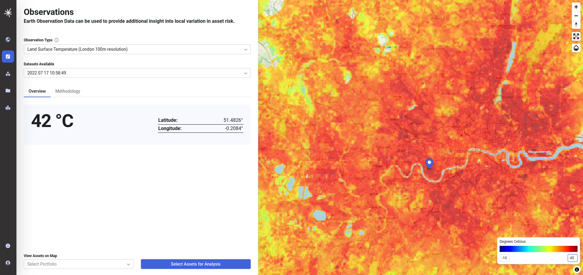
It is possible to adjust this by editing the values beneath the legend in the bottom right. By starting the colour ramp at 21 degrees and changing the upper value to 42 degrees, it accentuates the variation across the values within the dataset, thereby making it easier to visualise variation within the urban heat island effect - for example accentuating the areas cooled by vegetation in London parks.

Note
Check out our video on this on the training page
Viewing assets data on the map
It may be useful for you to view asset data on top of the map. The application includes a small number of sample portfolios that can be added using the menu at the bottom of the screen. You can also view your own asset data on the map, by uploading a CSV or GeoJSON file of asset data. To do this you must first login. Further information on asset data is included in the documentation on assets and portfolios.