Hazards
 The Hazards page is accessed from the left hand navigation bar:
Overview
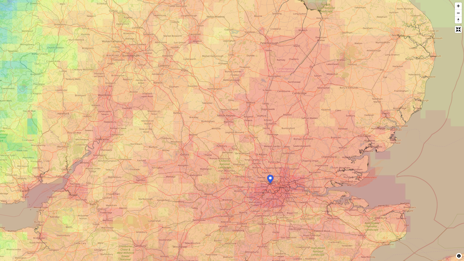
The Hazards page allows you to view Hazard Indicators on the map and overlay your own asset data on top. Hazard Indicators are datasets that are derived from Climate Projections that provide metrics for key climate indicators under a variety of future climate scenarios. An example of a Hazard Indicator for Chronic Heat is the number of days per year that the average temperature is expected to exceed a particular threshold. These indicators can be used to understand the potential exposure of assets to different risks in future.
Visualising Hazard Indicators
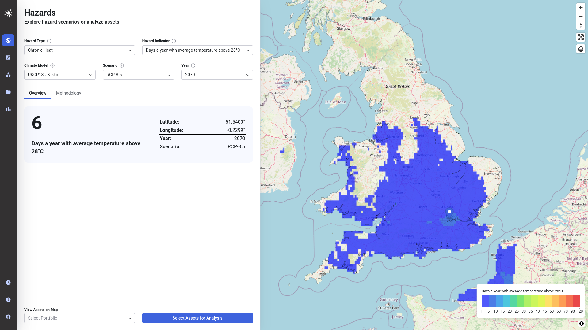
The left hand side of the Hazards screen allows you to select which indicators you view on the map using the menus provided. Different Hazard indicator datasets are available for different years and warming scenarios, according to the Climate Models that they are derived from. These are controlled as follows:
- Hazard type is a 'family' of indicators grouped together. At present just Chronic Heat is supported but others may be added in future.
- Hazard indicator is the metric that you will visualise. At present Days with average temperature above "X" and Degree days are supported.
- Climate Model is the Climate Projection that the indicator is derived from - such as CMIP6 or UKCP18. Some models are available at multiple resolutions.
- Scenario refers to the warming scenario - either an SSSP or RCP according to what is available in the Climate Model.
- Year is the year that will be visualised.
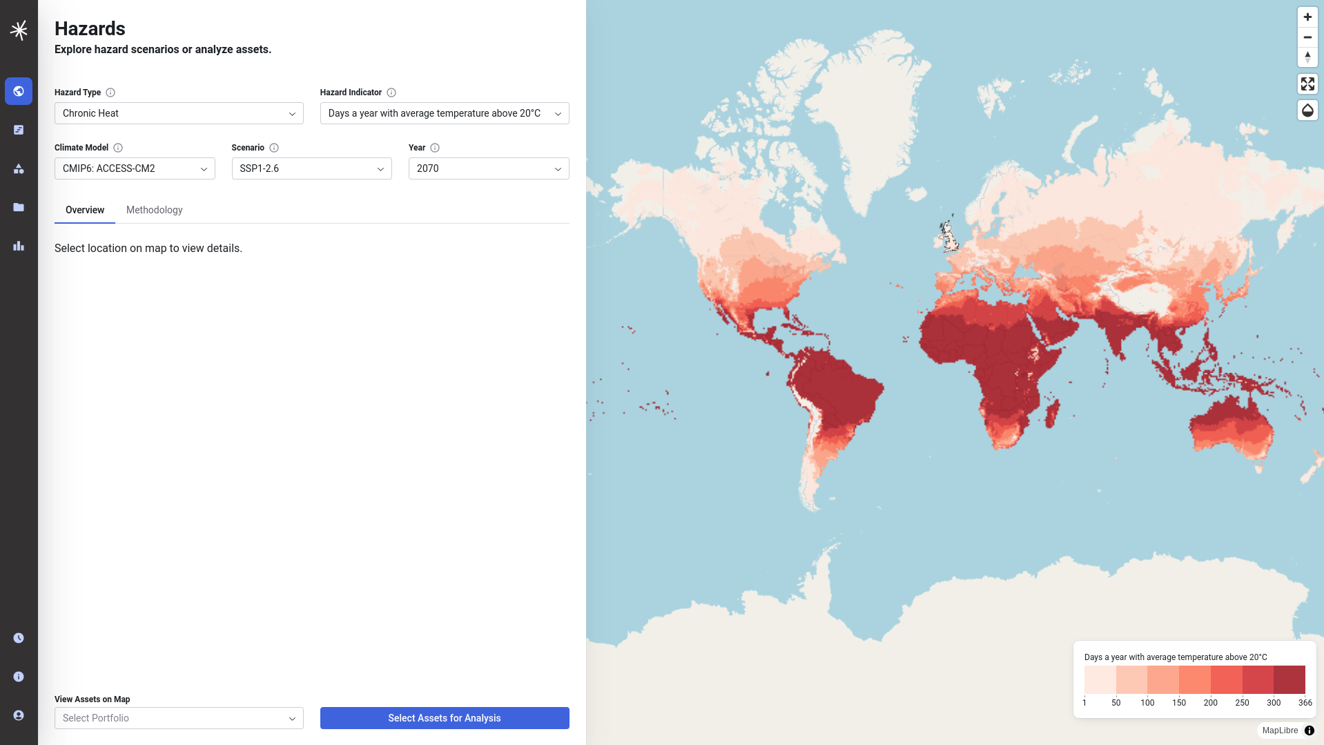
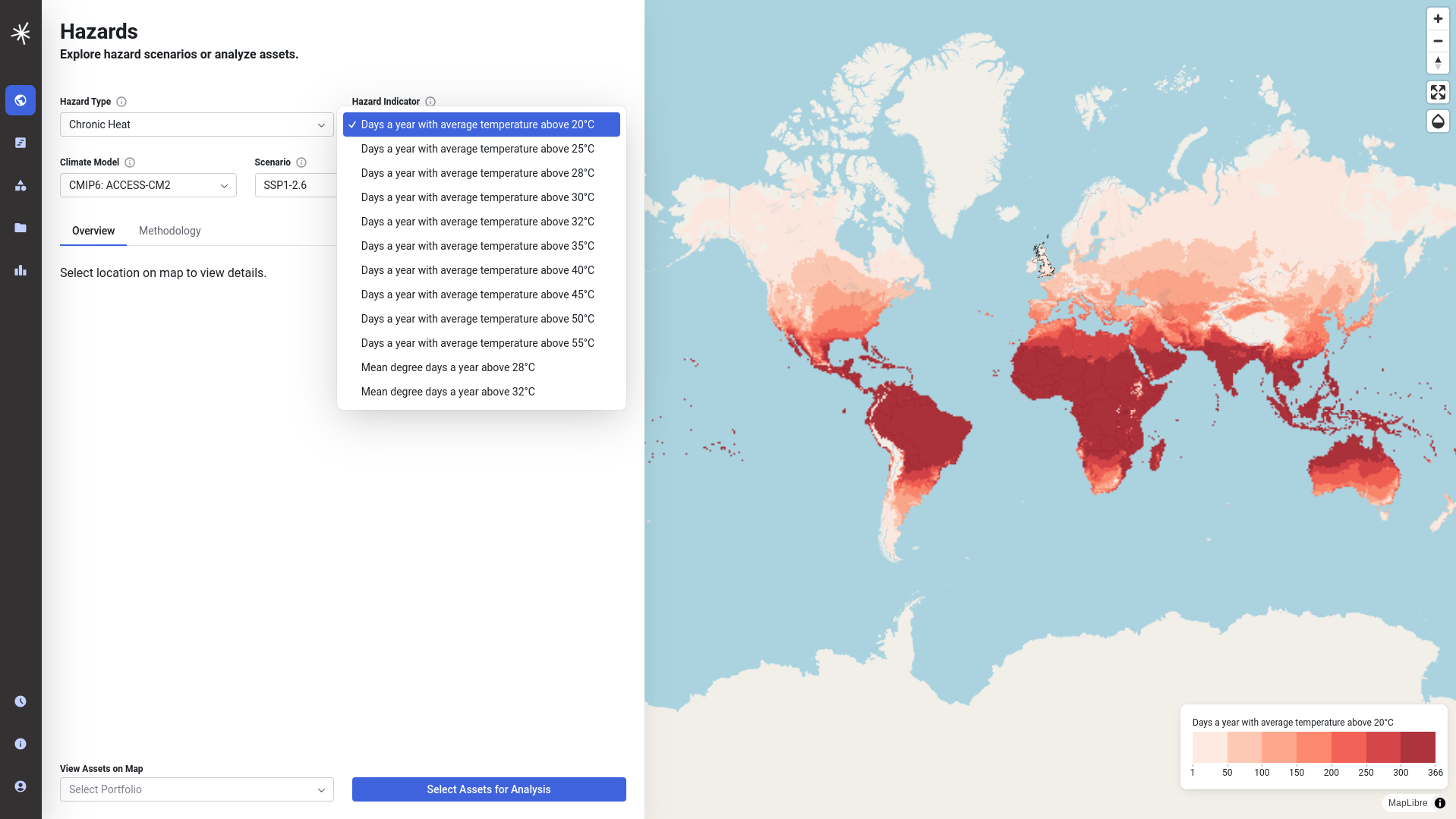
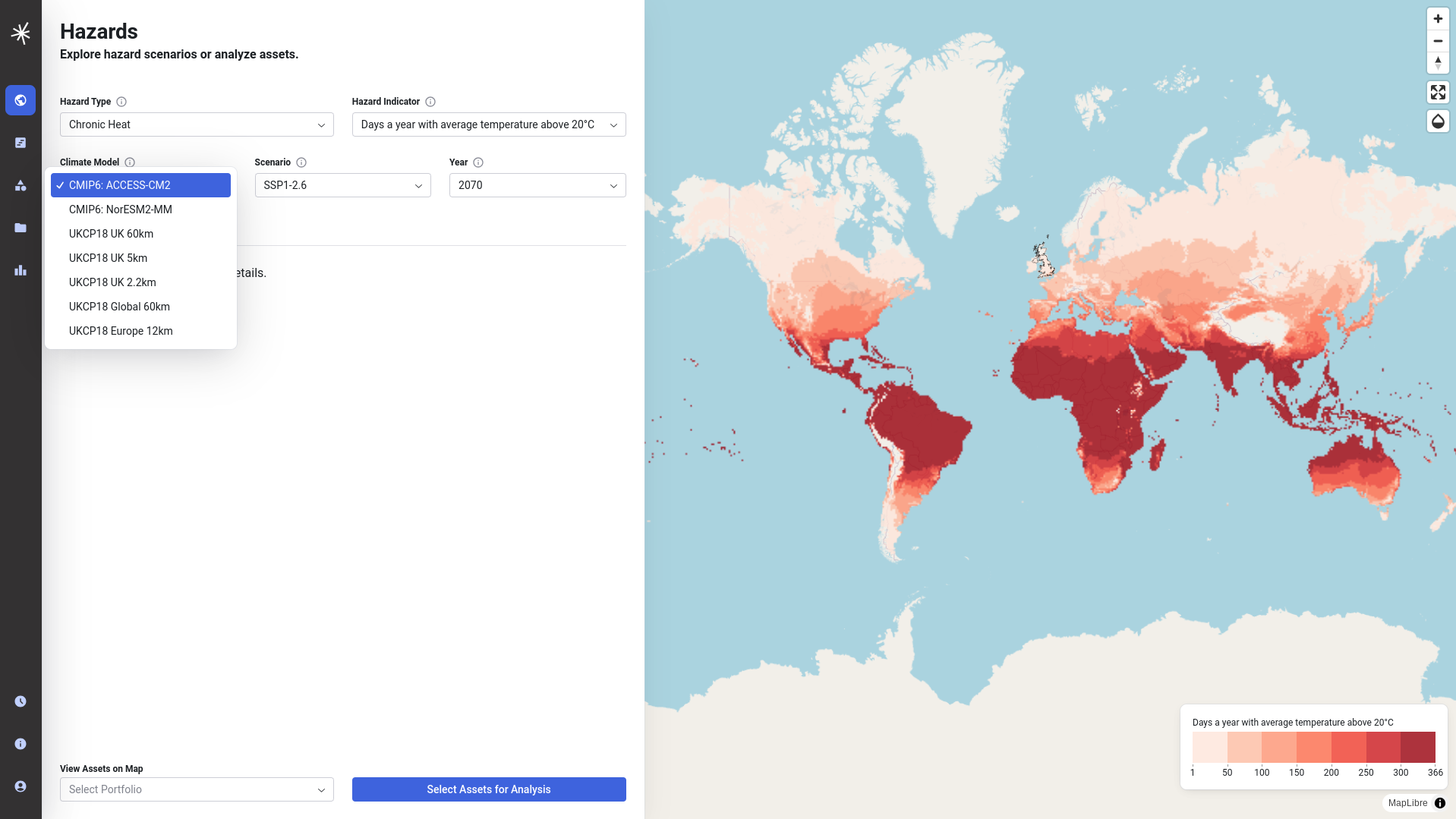
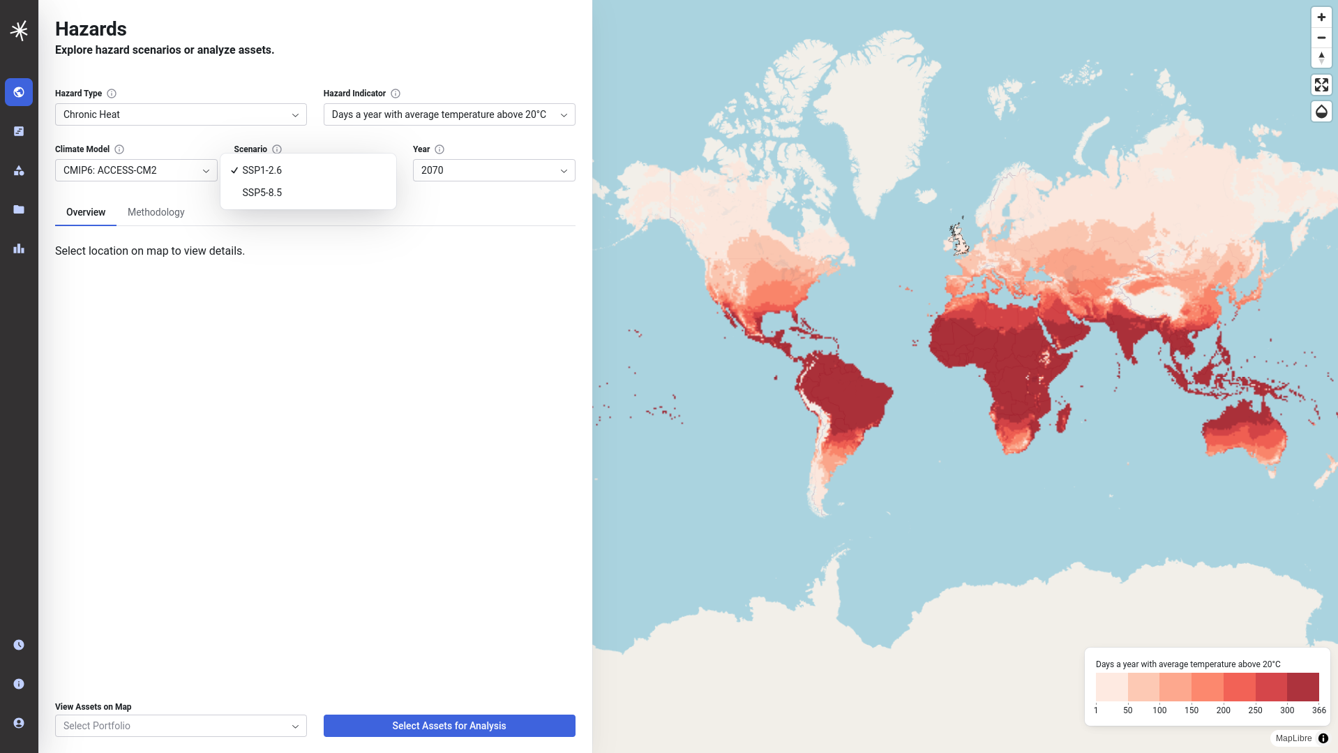
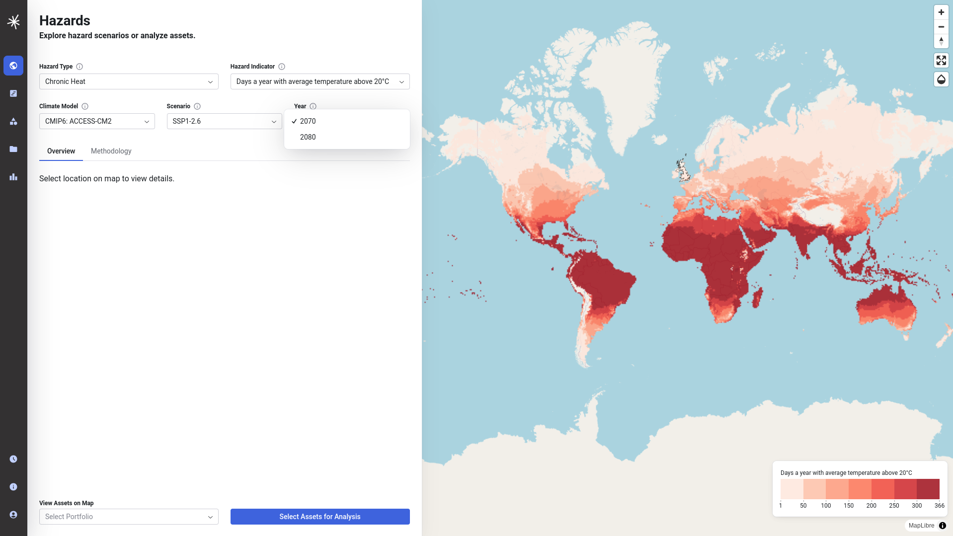
On selecting the parameters you are interested in the map will then refresh to display the relevant dataset.
Interrogating the Hazard Indicators
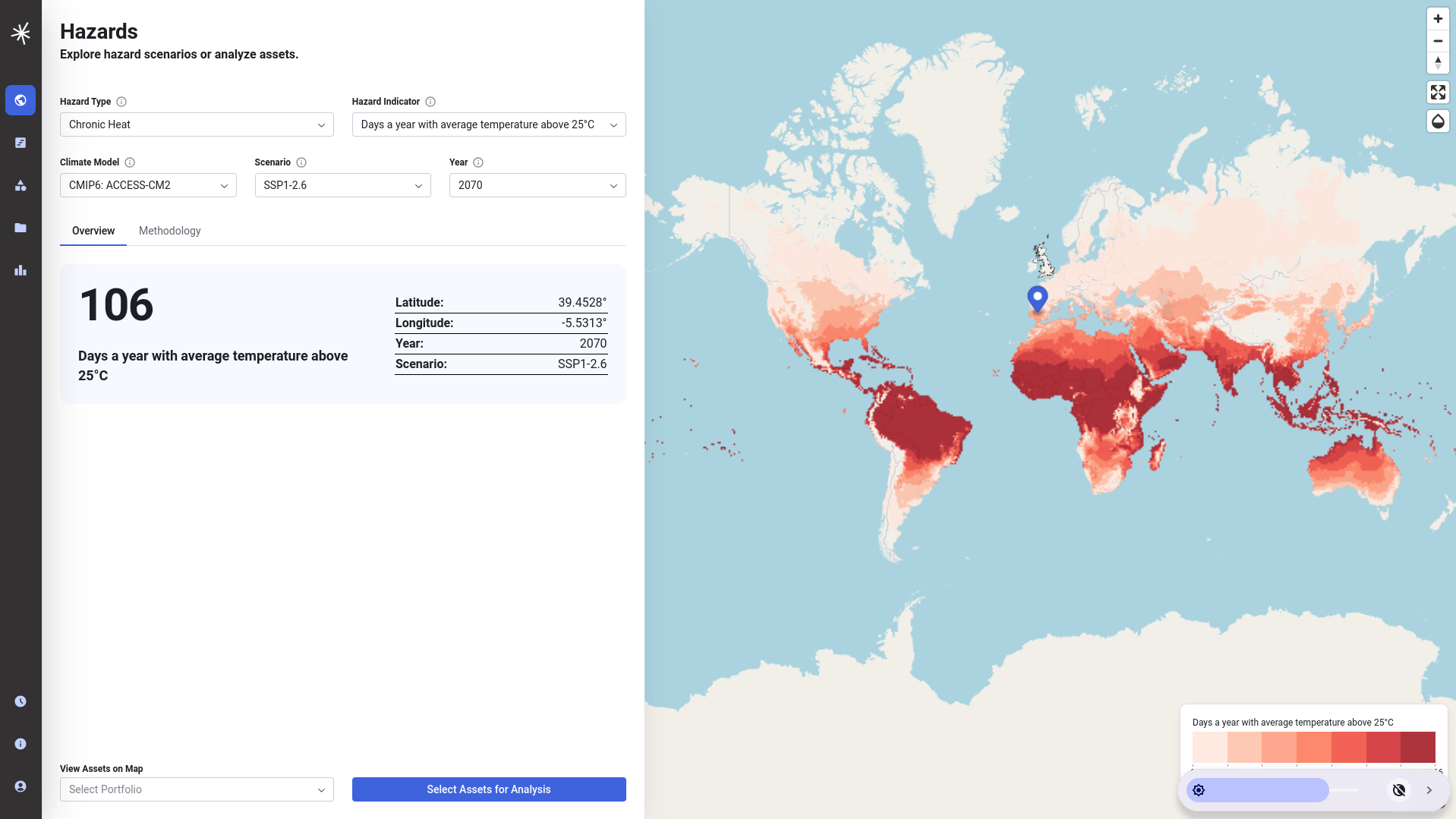
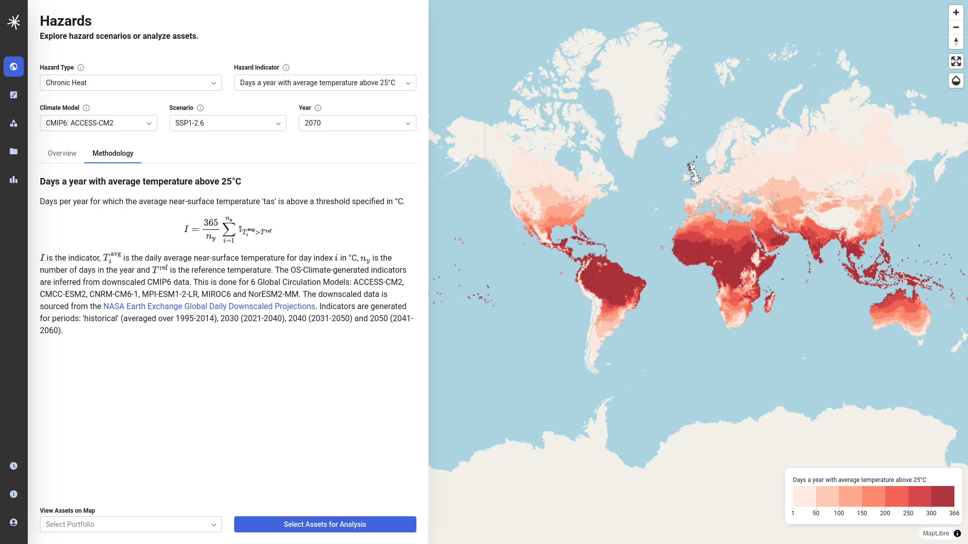
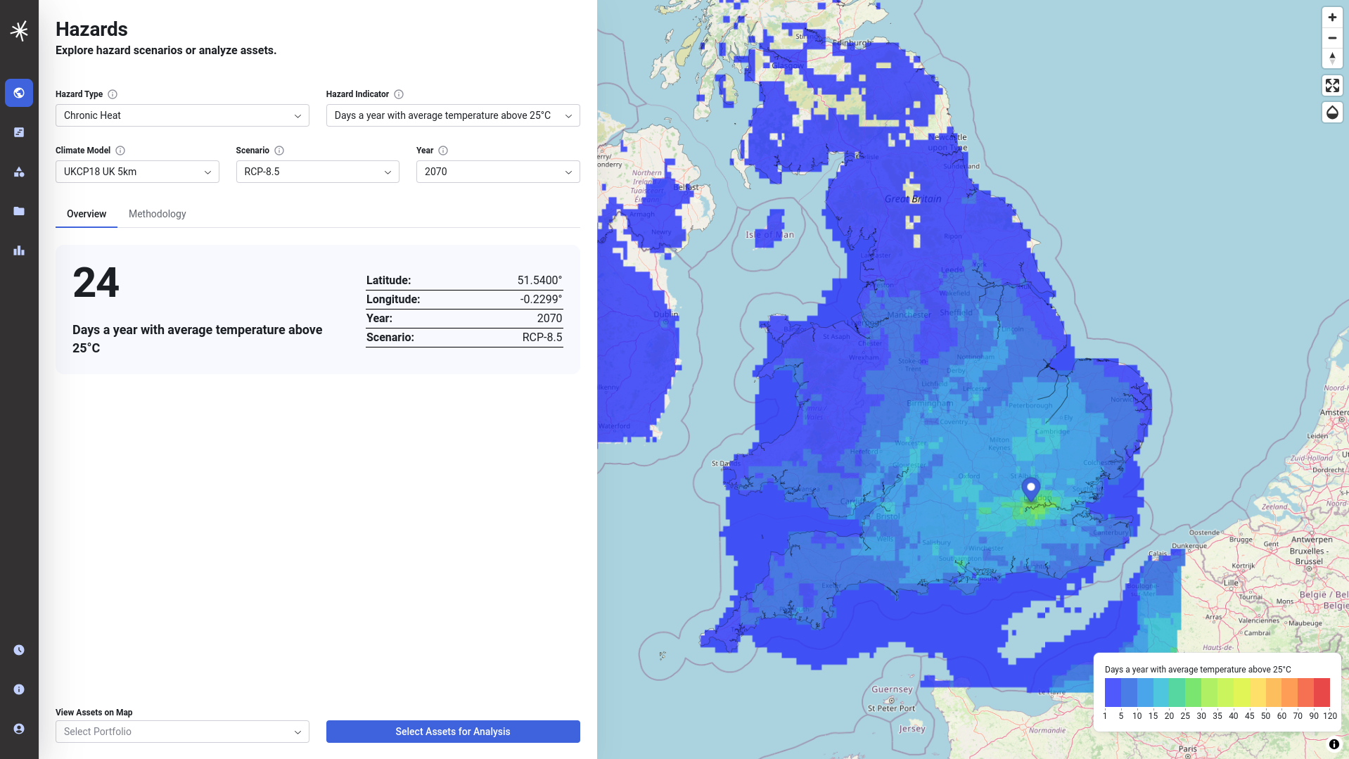
You can then click on the map itself to interrogate the value of the indicator at a given location. The value will refresh if you change the indicator you are displaying. In addition, the methodology tab provides some further detail into how the hazard indicator has been calculated. Selecting different Hazard Indicator datasets or climate models may also result in a change to the colour palette used on the map. This is to draw attention to the fact that the indicator is being visualised over a different range.
Changing the map opacity
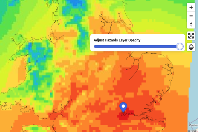
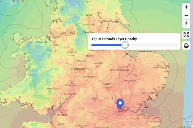
On occasions it may be useful for you to visualise data 'beneath' the indicator - such as the background maps. This can be done using the opacity control that you will find on the top right hand corner of the map window near the navigation controls.
Note
Be aware that when you change the opacity of the hazard indicator it will make colours appear lighter than when the layer is fully opaque, which could run the risk of misinterpreting its colour when compared to the legend. It is recommended that the click on map feature is used to check hazard indicator values explicitly when you have changed the opacity.
Full screen mode
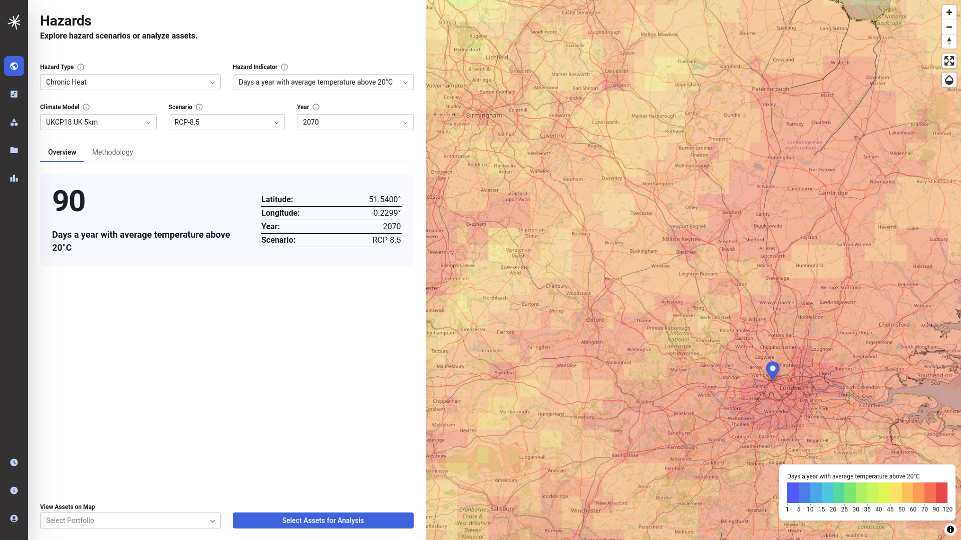
The mapping interface can also be viewed in full screen mode, using the expand icon in the map navigation menu. Press Esc to exit full screen.
Viewing asset data on the map
It may be useful for you to view asset data on top of the map. The application includes a small number of sample portfolios that can be added using the menu at the bottom of the screen. You can also view your own asset data on the map, by uploading a CSV or GeoJSON file of asset data. To do this you must first login. Further information on asset data is included in the documentation on assets and portfolios.